UI and UX design

UI and UX Design for Websites and Apps

Good interface design is mostly invisible. People find the thing they came for, understand what to do next and finish the task without thinking about the layout. Poor design shows up as abandoned bookings, support emails and visitors who leave from the menu.

Our designers work in Figma first, on websites for organisations across Australia and on our own products, including the Dawny surf forecasting app and the Shufl NFT marketplace on Algorand. Structure, flows and screens are agreed before development, when changes are still quick.
01.

Figma Before Code

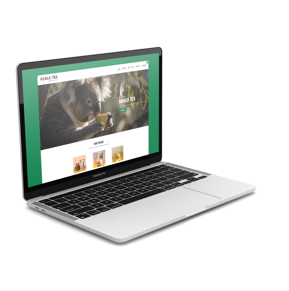
Every project begins as a design file you can click through. Koala Tea‘s slow, outdated site was redesigned from the ground up in Figma, and Richmond River Roofing was designed the same way before being built in WordPress.

02.

Information Architecture

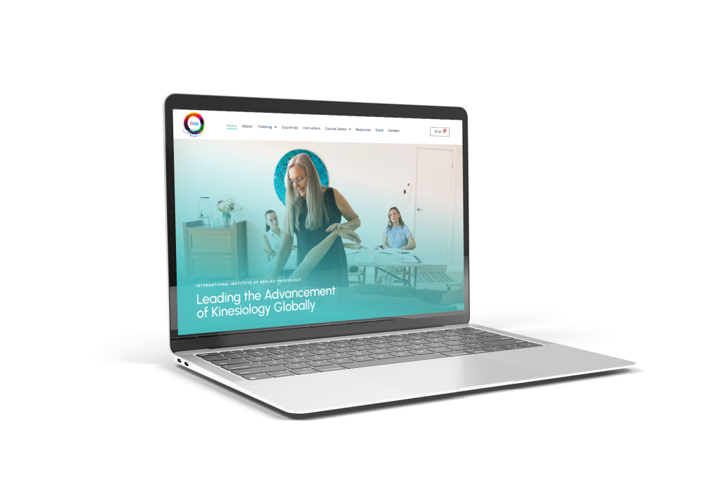
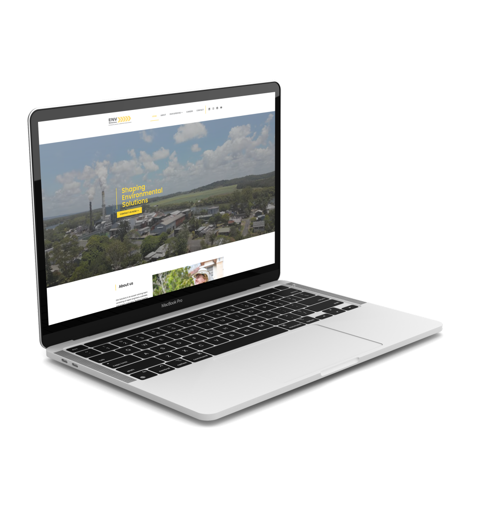
Complex organisations need a structure people can follow. IIAP Global presents education pathways to practitioners and institutions alike, and Env Solutions has a comprehensive mega menu so visitors reach the right engineering or consulting service fast.

03.

Designing for Sensitive Users

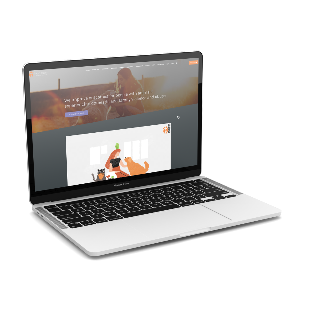
Lucy’s Project supports people and animals experiencing domestic and family violence. Its design uses a colour code to organise content and a quick exit button in the top corner, so anyone can leave the site immediately if they need to.

04.

Mobile-First Layouts

Most visitors arrive on a phone. Wild Byron Sea Safari was designed with a dedicated mobile experience that leads straight to tour bookings, and Myrtle Co was designed with mobile users as the priority from the start.

05.

Product and App Interfaces

Beyond websites, we design the screens of real products: Dawny, our surf forecasting app, and Shufl, an Algorand marketplace for artists and creators. Aurora Suspended Fires adds a 360 degree product slider and an in-room 3D model on mobile.

06.

How We Quote

UI and UX work is quoted on scope after a discovery call, based on how many screens, flows and user types are involved. Design can be a stage of a full build with us, or a standalone package handed to your own developers.

Designed in Figma, built to be used

October 2023

Koala Tea

Alstonville Web Design

July 2022

Lucy’s Project

Lismore Web Design

December 2022

Aurora Suspended Fires

Handcrafted Fireplace in Ballina

2025

iiap Global

Northern Rivers Website Design

February 2024

Env Solutions

Website development Byron bay

June 2022

Wild Byron Sea Safari

Byron Bay Web Design

March 2022

Richmond River Roofing

Ballina Web Design

March 2022

Myrtle Co

Alstonville Web Design

UI and UX design questions

UX is how the experience works: what people need, the order they do things in and where they get stuck. UI is what they see and touch: layout, type, colour and buttons. You need both, and treating them as one job is how we avoid beautiful screens nobody can use.

Figma lets you and your stakeholders review and comment on real layouts for desktop and mobile in one shared file, before development starts. Changes at that stage take minutes rather than days, and developers get exact measurements, colours and states to build from.

It’s quoted on scope after a discovery call. A focused marketing site with a handful of templates is a very different job from an app with accounts, dashboards and several user types. The proposal spells out the screens and flows included so nothing is left vague.

Often, yes. We review where users drop off or get confused, then redesign the parts causing the problems. Sometimes the honest answer is a rebuild from the ground up, which is what Koala Tea’s outdated, slow site needed, and we’ll tell you if that applies.

Yes. We hand over organised Figma files with components, responsive layouts and interaction notes, and stay available while your team builds. If you’d prefer we build it too, our team develops in WordPress with Elementor for websites.

By designing for it from the start: readable type sizes, strong colour contrast, clear headings, generous tap targets and navigation that works for keyboard and screen reader users. For audiences in difficult situations we go further, like the quick exit button we designed for Lucy’s Project.

No. We also design product interfaces, including our own Dawny surf forecasting app and the Shufl NFT marketplace on Algorand, built for artists, creators and communities. Designing products we run ourselves keeps us honest about what users actually do on screen.

Not at all. Design reviews and workshops run naturally over video, with everyone commenting in the same Figma file. We’re a team of five in Ballina NSW with more than 100 clients and work with organisations across Australia remotely.

Get in touch

Make your site or app easier to use

Send us a link to your site or a description of the product, and tell us where users get stuck. We’ll arrange a discovery call and scope the design work.